© DigitalFront | Built with courage.
A Logo’s Behind the Scenes
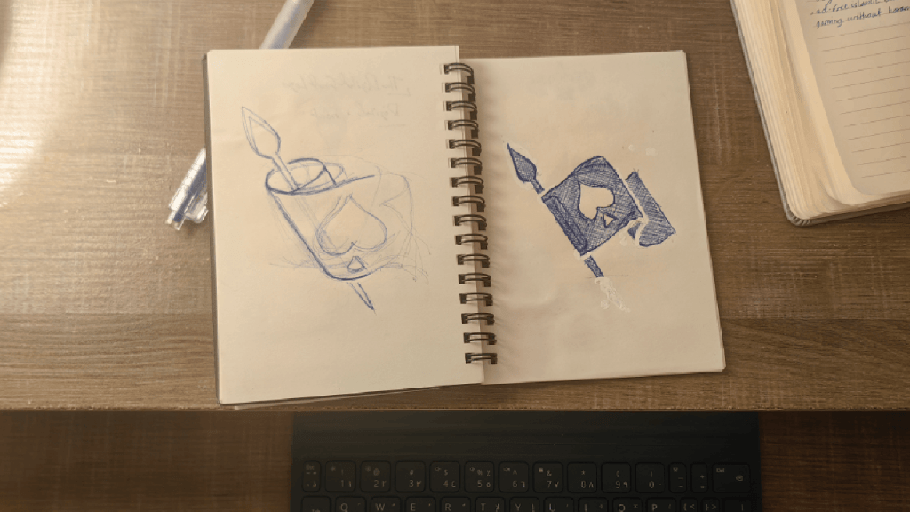
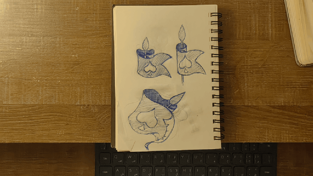
Every idea starts on the sketch note.
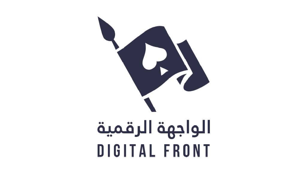
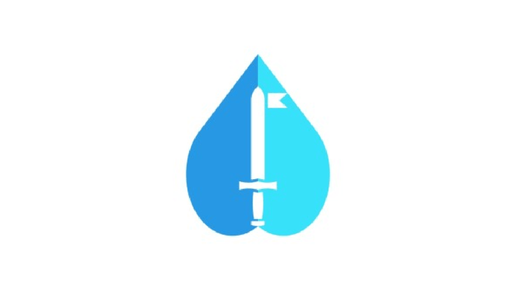
Let’s talk about the brand itself, DigitalFront, as the first topic of the vision page. There are three element components: the flag, the spade, and the spear. Each element has meaning behind it and on many levels.
The Flag: Geeks! Assemble!
A torn pirate-looking flag would’ve been more fun, but I went for a cleaner look.
The flag resembles both a place to gather and a starting point for me and the community to build an exciting future together.
The Spade: A Symbol With A Core
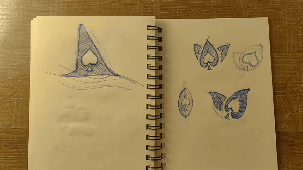
Building the logo around the spade alone obviously did not work. Even though the first logo was all about it.
The spade has a very special meaning to me, as it resembles my background as a gamer and a geek; it also resembles my ambitions and aspirations and how I want to overcome life difficulties through strategy, planning, and clear purpose.
The Spear: Belonging and Ancestry
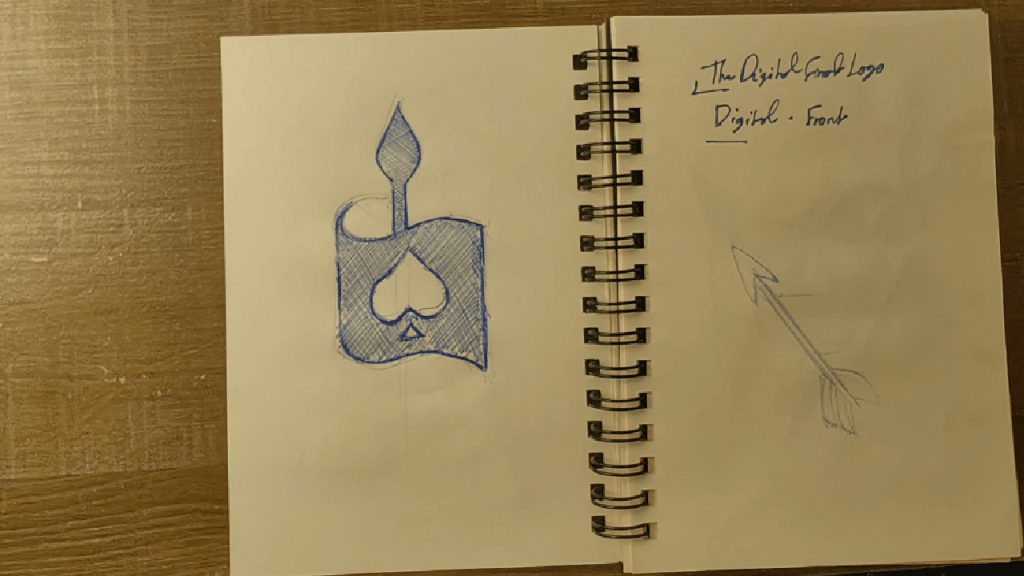
From a sword to arrows to finally a spear, it’s been a journey of drawings and many sketches.
In a world where modern society celebrates the cultureless way of living, one must know and be aware of his/her origins and where one came from to leave the legacy the upcoming generations need for a better future.
It Was Such An Enjoyable Challenge
The old one served me well for some time, but I did not feel that it expressed truly who I am or my vision.
Finally, the logo was drawn by hand to get this flowy, fun-looking, game-like feel to it, and it indeed looks like an icon for an adventure or an RPG game, and frankly, to a degree, this is how life feels a lot of times; we just need to gamify it correctly. Now let’s go and build with courage.

Leave a comment